zelfortin
2013-08-01 18:06:42 UTC
Hi all,
I have stacked bar plots that I want to fill with symbols/ lines rather
than colors. Here is what my script looks like to fill with colors:
Coul <- c("#990000","#FF3300","#FF6633","#999999","#CCFF99","#33CC00")
Plot1 <- qplot(factor(Model),data=Best,
geom="bar",fill=factor(Best$New.Curve), xlab="Model", ylab="Count") +
labs(title=paste("Best models by country for ", File[e], sep="")) +
scale_fill_manual(values=Coul)
Plot1
So I'm looking to get something more like this:
[image: Loading Image...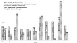 ]
]
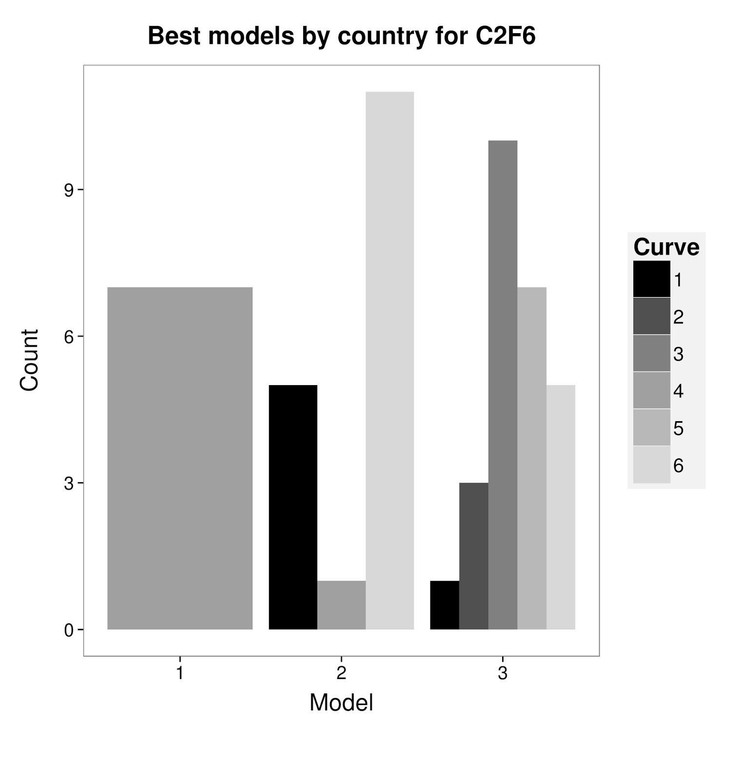
Rather than what I get:
<Loading Image...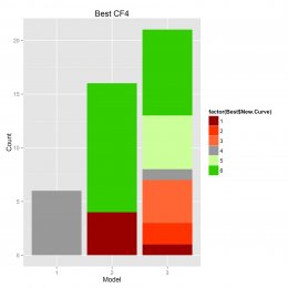 >
>
Any help would be much appreciated.
Cheers
JM
<https://lh5.googleusercontent.com/-vQZFiEbK59w/UfqjXBsCMDI/AAAAAAAAAJs/2qnmKmhTzvA/s1600/CF4_BestStack.png>
--
--
You received this message because you are subscribed to the ggplot2 mailing list.
Please provide a reproducible example: https://github.com/hadley/devtools/wiki/Reproducibility
To post: email ggplot2-/***@public.gmane.org
To unsubscribe: email ggplot2+unsubscribe-/***@public.gmane.org
More options: http://groups.google.com/group/ggplot2
---
You received this message because you are subscribed to the Google Groups "ggplot2" group.
To unsubscribe from this group and stop receiving emails from it, send an email to ggplot2+unsubscribe-/JYPxA39Uh5TLH3MbocFF+G/***@public.gmane.org
For more options, visit https://groups.google.com/groups/opt_out.
I have stacked bar plots that I want to fill with symbols/ lines rather
than colors. Here is what my script looks like to fill with colors:
Coul <- c("#990000","#FF3300","#FF6633","#999999","#CCFF99","#33CC00")
Plot1 <- qplot(factor(Model),data=Best,
geom="bar",fill=factor(Best$New.Curve), xlab="Model", ylab="Count") +
labs(title=paste("Best models by country for ", File[e], sep="")) +
scale_fill_manual(values=Coul)
Plot1
So I'm looking to get something more like this:
[image: Loading Image...
 ]
]Rather than what I get:
<Loading Image...
 >
>Any help would be much appreciated.
Cheers
JM
<https://lh5.googleusercontent.com/-vQZFiEbK59w/UfqjXBsCMDI/AAAAAAAAAJs/2qnmKmhTzvA/s1600/CF4_BestStack.png>
--
--
You received this message because you are subscribed to the ggplot2 mailing list.
Please provide a reproducible example: https://github.com/hadley/devtools/wiki/Reproducibility
To post: email ggplot2-/***@public.gmane.org
To unsubscribe: email ggplot2+unsubscribe-/***@public.gmane.org
More options: http://groups.google.com/group/ggplot2
---
You received this message because you are subscribed to the Google Groups "ggplot2" group.
To unsubscribe from this group and stop receiving emails from it, send an email to ggplot2+unsubscribe-/JYPxA39Uh5TLH3MbocFF+G/***@public.gmane.org
For more options, visit https://groups.google.com/groups/opt_out.