Greg Blevins
2013-07-05 03:02:41 UTC
df <- structure(list(q9_1recodet = c(1, 0, 1, 1, 0, 0, 0, 0, 0, 0,
0, 0, 1, 0, 0, 0, 0, 0, 0, 0, 0, 0, 0, 1, 0, 0, 1), q9_2recodet = c(1,
0, 1, 0, 0, 0, 0, 0, 0, 0, 0, 0, 1, 0, 0, 0, 0, 1, 0, 0, 1, 1,
0, 0, 0, 0, 1), q9_3recodet = c(1, 0, 1, 0, 0, 0, 0, 0, 0, 0,
0, 1, 0, 1, 1, 0, 0, 0, 0, 1, 1, 0, 0, 1, 0, 0, 1)), .Names =
c("q9_1recodet",
"q9_2recodet", "q9_3recodet"), row.names = c(1L, 2L, 3L, 4L,
5L, 6L, 8L, 9L, 11L, 12L, 13L, 14L, 15L, 16L, 17L, 18L, 19L,
20L, 22L, 23L, 24L, 25L, 26L, 27L, 28L, 29L, 30L), class =
"data.frame", na.action = structure(c(7L, 10L, 21L), .Names = c("7", "10",
"21"), class = "omit"))
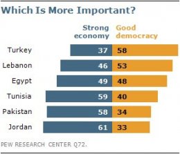
I would like to create a graph similar to the image shown here -- this type
of graph is frequently used by the Pew Research center.
<Loading Image... >
>
I manipulate the data as follows to get summary measures:
df <- melt(df)
a <- with(df, ftable(xtabs(~ value + variable)))
a <- round(prop.table(a,2) * 100, 0)
a <- as.data.frame(a)
My summary data looks like this:
value variable Freq
1 0 q9_1recodet 78
2 1 q9_1recodet 22
3 0 q9_2recodet 74
4 1 q9_2recodet 26
5 0 q9_3recodet 67
6 1 q9_3recodet 33
g2 <- ggplot(a, aes( x = variable, y = Freq, fill = value, width=0.9)) +
geom_bar(stat ="identity", position ="dodge") +
geom_text(aes(label = Freq), vjust = -0.4, colour ="black", position =
position_dodge(.9), size = 4)
g2 + coord_cartesian(ylim = c(1,100))
<Loading Image... >
>
But, at this point I am stumped on how to proceed to generate a
"back-to-back" bar plot like the Pew example shown above. Hence, I would
like the light blue bars in the bar chart above to display to the right and
the red bars to display to the left. Any help would be much appreciated.
Thanks,
Greg
--
--
You received this message because you are subscribed to the ggplot2 mailing list.
Please provide a reproducible example: https://github.com/hadley/devtools/wiki/Reproducibility
To post: email ggplot2-/***@public.gmane.org
To unsubscribe: email ggplot2+unsubscribe-/***@public.gmane.org
More options: http://groups.google.com/group/ggplot2
---
You received this message because you are subscribed to the Google Groups "ggplot2" group.
To unsubscribe from this group and stop receiving emails from it, send an email to ggplot2+unsubscribe-/JYPxA39Uh5TLH3MbocFF+G/***@public.gmane.org
For more options, visit https://groups.google.com/groups/opt_out.
0, 0, 1, 0, 0, 0, 0, 0, 0, 0, 0, 0, 0, 1, 0, 0, 1), q9_2recodet = c(1,
0, 1, 0, 0, 0, 0, 0, 0, 0, 0, 0, 1, 0, 0, 0, 0, 1, 0, 0, 1, 1,
0, 0, 0, 0, 1), q9_3recodet = c(1, 0, 1, 0, 0, 0, 0, 0, 0, 0,
0, 1, 0, 1, 1, 0, 0, 0, 0, 1, 1, 0, 0, 1, 0, 0, 1)), .Names =
c("q9_1recodet",
"q9_2recodet", "q9_3recodet"), row.names = c(1L, 2L, 3L, 4L,
5L, 6L, 8L, 9L, 11L, 12L, 13L, 14L, 15L, 16L, 17L, 18L, 19L,
20L, 22L, 23L, 24L, 25L, 26L, 27L, 28L, 29L, 30L), class =
"data.frame", na.action = structure(c(7L, 10L, 21L), .Names = c("7", "10",
"21"), class = "omit"))
I would like to create a graph similar to the image shown here -- this type
of graph is frequently used by the Pew Research center.
<Loading Image...
I manipulate the data as follows to get summary measures:
df <- melt(df)
a <- with(df, ftable(xtabs(~ value + variable)))
a <- round(prop.table(a,2) * 100, 0)
a <- as.data.frame(a)
My summary data looks like this:
value variable Freq
1 0 q9_1recodet 78
2 1 q9_1recodet 22
3 0 q9_2recodet 74
4 1 q9_2recodet 26
5 0 q9_3recodet 67
6 1 q9_3recodet 33
g2 <- ggplot(a, aes( x = variable, y = Freq, fill = value, width=0.9)) +
geom_bar(stat ="identity", position ="dodge") +
geom_text(aes(label = Freq), vjust = -0.4, colour ="black", position =
position_dodge(.9), size = 4)
g2 + coord_cartesian(ylim = c(1,100))
<Loading Image...
But, at this point I am stumped on how to proceed to generate a
"back-to-back" bar plot like the Pew example shown above. Hence, I would
like the light blue bars in the bar chart above to display to the right and
the red bars to display to the left. Any help would be much appreciated.
Thanks,
Greg
--
--
You received this message because you are subscribed to the ggplot2 mailing list.
Please provide a reproducible example: https://github.com/hadley/devtools/wiki/Reproducibility
To post: email ggplot2-/***@public.gmane.org
To unsubscribe: email ggplot2+unsubscribe-/***@public.gmane.org
More options: http://groups.google.com/group/ggplot2
---
You received this message because you are subscribed to the Google Groups "ggplot2" group.
To unsubscribe from this group and stop receiving emails from it, send an email to ggplot2+unsubscribe-/JYPxA39Uh5TLH3MbocFF+G/***@public.gmane.org
For more options, visit https://groups.google.com/groups/opt_out.